Designed a Dynamic Total Rewards Experience
helping employees understand, trust, and evaluate their compensation
Context
Saffron(name changed due to NDA reasons) employees receive compensation updates at multiple points in their lifecycle, including annual reviews, promotions, role changes, and other off-cycle events.
The Total Rewards Statement (TRS) is the primary interface through which employees view and interpret these outcomes.
However, this experience existed as a data document rather than a thoughtfully designed experience.
Scope of the case study
This case study explains how I redesigned the Total Rewards experience from just displaying compensation data to an experience which creates trust and improves perception of their actual compensation
The Total Rewards experience presents data without sufficient context, structure, or explanation. As a result, employees rely on partial signals like base salary, question the accuracy of information, and depend on managers or HR for basic clarity.
This leads to low perceived fairness, even when compensation is competitive.
Employees questioned if they were paid fairly
Compensation did not feel clearly linked to performance
Clarity was lacking, making it difficult for employees to understand how different components contributed to their total compensation.
How I approached the problem
Perception becomes a key factor in how employees interpret and judge the value of their compensation.
If perception drops, even strong pay feels unfair.
If perception improves, constrained pay feels understood
Factors that drive perception
01
Clarity
Structural understanding of total rewards.
02
Trust
Nothing should feel hidden/ manipulative
03
Expectation alignment
What they expect and what they actually get
04
Relative Positioning
Understand where they stand relative to their peers
The goal was to shift perception from
“I see my salary and details”
to
“This is how Saffron rewards me for the value I bring.”
Initial explorations for the summary section


Explored interaction patterns for the “What changed” section, which emerged as a key area of interest during initial user testing.
But I had to discard this design as it was hiding important information behind interaction cost. Users should be able to see the changes upfront without needing extra clicks
The experience lacked a narrative and started to feel like a data dashboard, so I reimagined the entire experience to make it more narrative driven
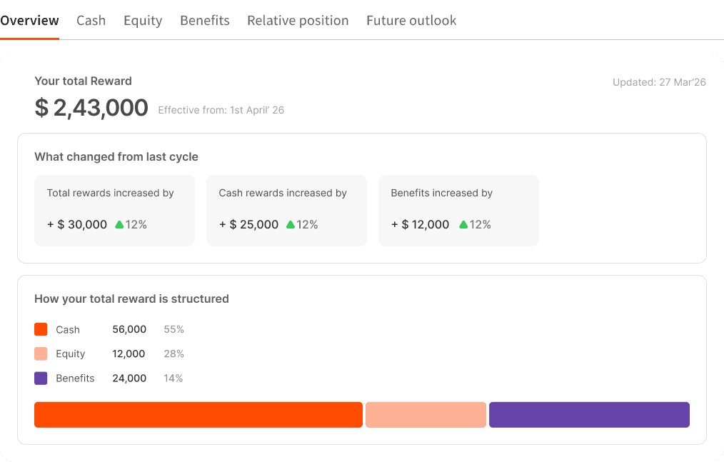
After few more iterations the summary section was finalized
Design decisions taken
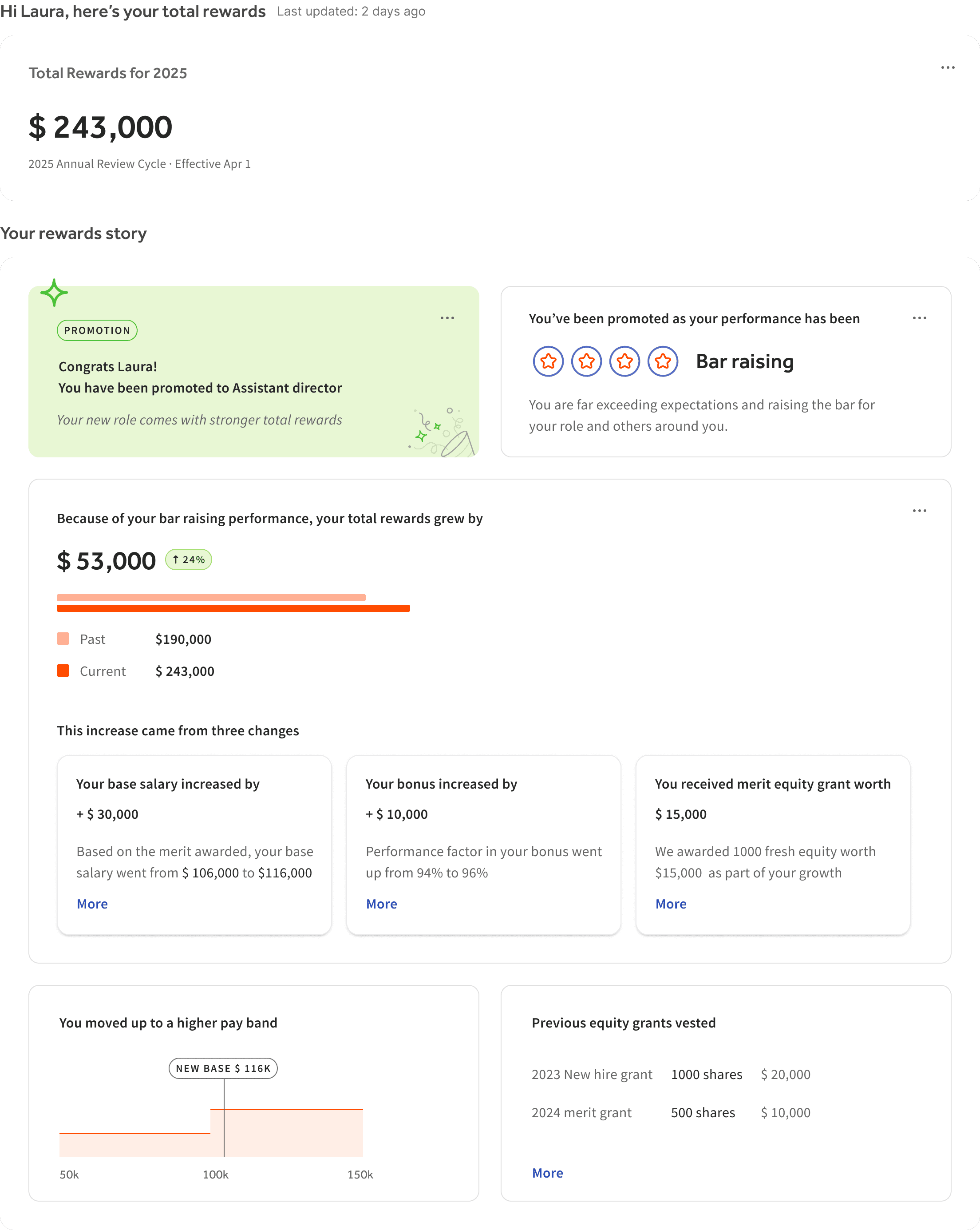
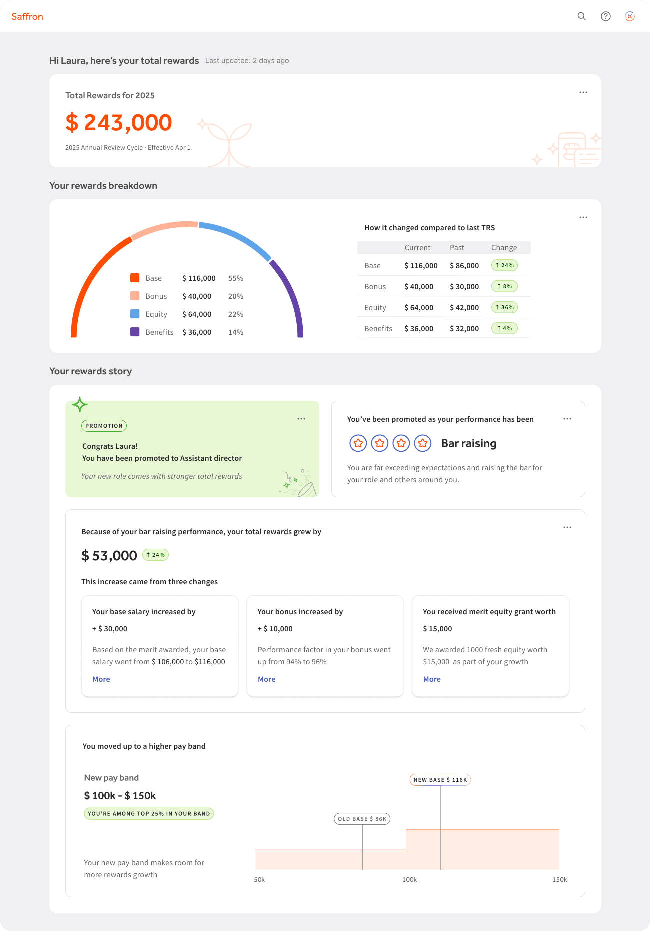
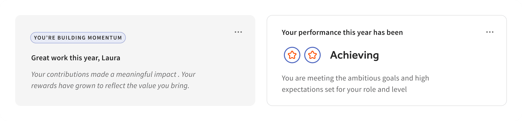
The first touchpoint in the rewards story acts like a personalized note from Saffron, recognizing achievements and offering support when it matters most.


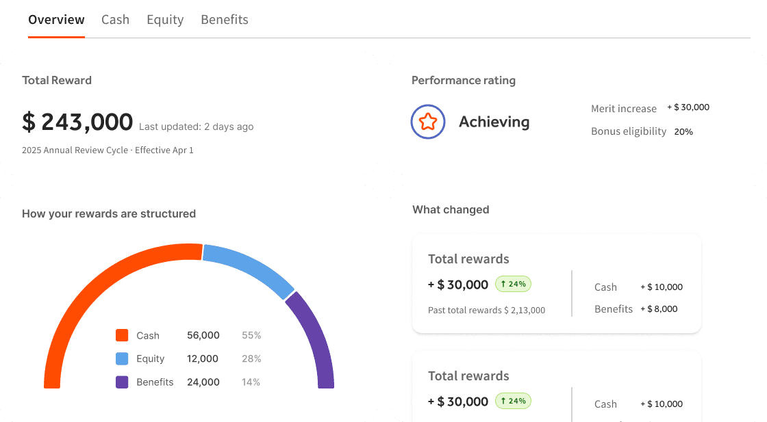
Designing the breakdown of the components
Cash rewards
Equity rewards
Benefits

Impact that the new experience had
Shifted the experience from data consumption to meaningful understanding, improving perceived fairness and reducing confusion around compensation.